SPOTLIGHT ON: ELECTRIC BLUE

Nicole from En Shell back at it again!


Here at a Naber Design, we are not ones to shy away from color. Abbie’s signature look starts with a clean, neutral base, then layers of personality are added through the use of art, bold shapes, and yep, color. One color that is always a tried-and-true favorite due to its ability to add the right amount of zing and exuberance into a space is electric blue. We are talking about the vibrant shades of cobalt, ultramarine, lapis, and indigo. 

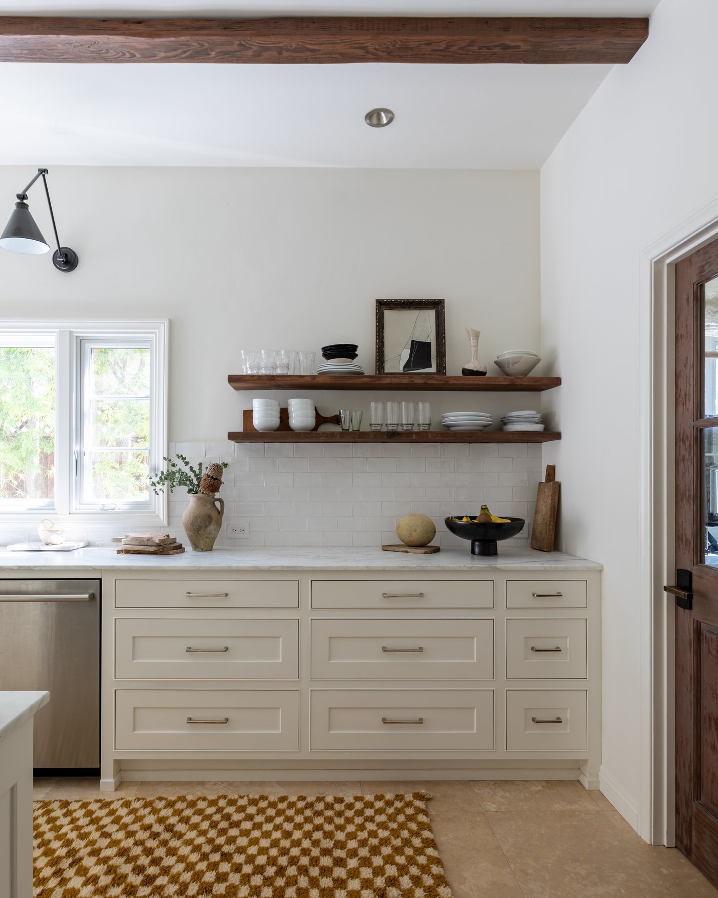
Project Cathy / photography: Charlotte Lea / styling: En Shell Space & California Casa

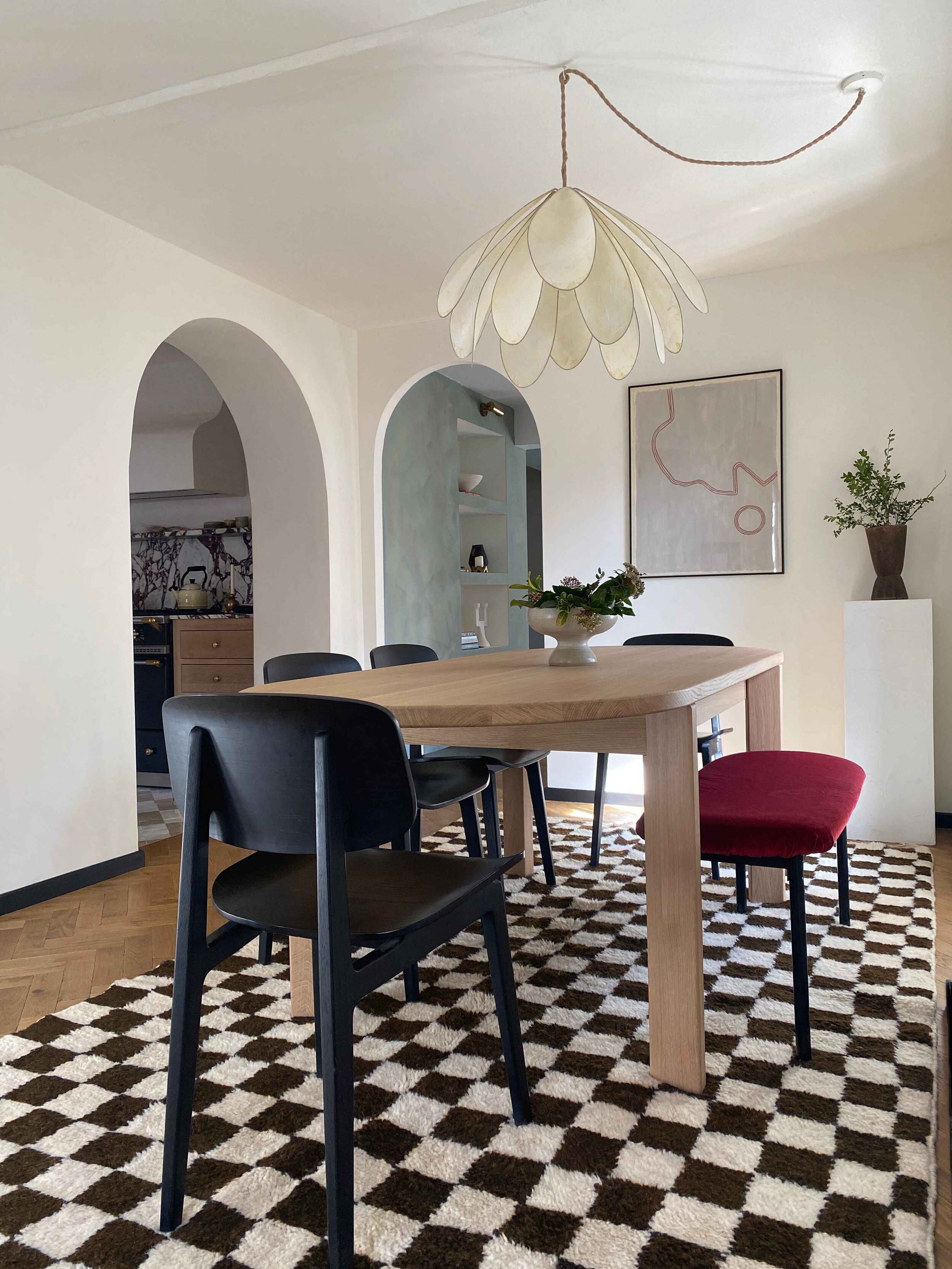
Project Blue Lake / photography: Charlotte Lea

Throughout creative bursts in history, bold shades of blue have been known to encourage inventiveness, steer individuals away from the habitual, and carve new paths of freedom and optimism. There’s a reason it has been a favorite of artists, architects, and designers throughout the ages, like Picasso, Matisse, Frank Lloyd Wright, and Jacques Majorelle. For anyone who has witnessed or seen a photograph of Jardin Majorelle in Marrakech, I think you can attest to the stunning power and sheer brilliance this particular hue of blue instills. It’s transfixing, striking, and confident yet still feels playful, fresh, and happy. 

After two whole years of being cooped up at home and feeling the restless effects that came along the way, it is no coincidence that designers and artists alike are reaching for energetic blues that represent hope, innovation, and creativity. We are in a time where we all are quite literally seeking a breath of fresh air, so the usage of anything deep and vibrant feels liberating and renewing, to say the least.

This particular lively color feels like a refreshing pop of contrast against any backdrop, and it provides the right amount of joyful zest into any space. Communicating through color is our jam, and we are all game to create a buzz and add some show-stopping edge to our designs through the use of blue.

Check out our round-up of all things electric blue, and try adding a little zingy goodness into your home today!

1: Cedar and Moss Sconce / 2: Vase by Kuu Pottery / 3: Art by Karina Bania / 4: Pitcher by Guten Co / 5. Mug by Ekua Ceramics / 6. HK Living Lamp / 7. Vase by Objet Aimee / 8: HAY Side Table / 9: Bedspread by LRNCE / 10: Thompson Street Studio Pillow /

The Foolproof Styling Guide for Fool’s Gold:

Hi! It’s Nicole here of En Shell contributing to the a Naber Design Blog….

What do you get when you merge age-old Moroccan weaving methods with a timeless print, aging back centuries, but with a fresh take and modern eye? The a. Naber Design and June + Blue Checkmate Collection, that’s what! We are here to bring you a work of art for the floor. Yep, this hand-loomed beauty of a collaboration is the perfect statement piece while still being able to blend with any interior style: global boho, Scandinavian modern, colonial farmhouse- you name it! Though checks are indeed trending, they can and have proven to stand the test of time. They are quite the versatile print and can go with just about any type of décor.

Fool’s Gold Checkmate 02 Rug shown in the stunning kitchen of Carol Estes.Photography: Laurel Wood Creative

Fool’s Gold Checkmate 02 Rug shown in the stunning kitchen of Carol Estes.

Photography: Laurel Wood Creative

One colorway that is really calling our names from the collection is the “Fool’s Gold.” It’s the perfect mix of warm mustard, earthy ochre, and burnt-golden orange. It feels almost like a neutral in our eyes and can work year-round. "Fool’s Gold" pairs well with other warm earth tones, soft neutrals, and even a bold contrast color, like black. You can see it here styled flawlessly in Carol Estes Design’s home as the ultimate grounding and textural base. So on that note, we thought it would be fun to give you all a couple of styling ideas and décor pairings so you can nail a foolproof “Fool’s Gold” look in your own home. Happy shopping, friends!

style checkmate.001.jpeg

MOOD: WARM MODERN

Hey Everyone! It’s Nicole here, (En Shell) contributing to the a Naber Design blog!

Maybe it’s the weather that’s starting to heat up, but it’s safe to say that I have been embracing this warm modern mood that I keep seeing swirling around the interiors realm. We’re talking caramel-toned browns, tans, ivories, and all the yummy neutrals. Throw in some black for an extra level of moody contrast, and you have me over here swooning. There’s something so cozy yet so clean and open about this look. Lately, I’ve been loving the idea of pairing sculptural shapes and forms with clean and crisp lines. Add in layers of textures mixed with rich natural materials, and you have the key to my heart. So while I’m in that warm minimalism frame of mind, here’s a little moodboard to inspire you, too. Enjoy!

Warm Modern

Warm Modern

Source: www.anaberdesign.com

TRENDING: CHECK this out...

Trend alert! If you’re an active user on Instagram and love following along with what’s happening in design, then it’s hard to miss a certain classic pattern that keeps circulating amongst all of us, design lovers. Yup, I’m talking checkers! I’ve been seeing checkered tile patterns in both bold colorways with lots of contrast and also in more subtle color palettes with soft, tonal hues. It’s even trickled its way into home accessories, linens, and rugs in scales big and small. It’s hard to escape these classic little squares. A checkered pattern is no new thing, but somehow, it is feeling fresher than ever. I’m all for it and hope it’s not going anywhere anytime soon. From shower floors and walls to ceramics and bedding, I’ve rounded up a few of my favorite looks and uses for this graphic favorite. Enjoy!

checkered.001.jpeg
  1. Transition State Design / 2. Sarah Sherman Samuel / 3. Mother of God Ceramics /

    4. Helena Haddox Ceramics / 5. Maria Lenskjold Ceramics / 6. KLH Custom Homes /

    7. Nicky Kehoe / 8. Historical Apartment by Veresknovsky Interior Design

And this is where I segue into a little teaser about an upcoming collaboration with one of my good friends, Becca who owns June and Blue. Becca and I have been working on a Capsule collection titled, “Check-Mate.” How fitting, right? Our rug collection will consist of several checkered beauties in neutrals and wait for it… even a beautiful goldenrod hue. Our rugs will be available in various runner sizes and made to order! We are currently in the color approval process and a few are even on the loom as we speak! And, if you have ants in your pants and can’t wait, Becca currently has a few Bespoke options on her website. I’ve linked them below for you all.

  1. Checkered Rug (June and Blue) / 2. Checkered Rug shown in Dining Room / 3. Checkered Micro Rug (June and Blue)

Lastly, I’ll brag about my friend Becca a bit more. This is her kitchen that she recently renovated! She used my favorite zellige tile in a checkered pattern. Brilliant, I say!

Lastly, I’ll brag about my friend Becca a bit more. This is her kitchen that she recently renovated! She used my favorite zellige tile in a checkered pattern. Brilliant, I say!

Hope you enjoy and stay tuned for more information about our rug drop!

Xo,

Abbie

ROUNDUP: Ceramics!

If you have been following me along on Instagram, it’s no secret that I have a major appreciation for ceramics. Ceramics have such a special way of bringing character and personality into a space. They are the cherry on top of any room adding layers of warmth and texture. Lamps, vases, vessels, and tabletop, each piece carries its own unique, handmade attributes that bring a room to life and gives your home some soul. The best part about ceramics is that I’m discovering a new maker and style that I love almost daily, and who doesn’t love variety and new discoveries? 

Project Gregory  Photography: Charlotte Lea

Project Gregory Photography: Charlotte Lea

Project Keep It Neutral  Photography: Charlotte Lea

Project Keep It Neutral Photography: Charlotte Lea


I’ve rounded up a few from near and far. Some are funky and bold, while others are clean and paired back. The glory of ceramics is that you can easily mix and match styles for whatever taste or mood you may be feeling for that moment in time. So take a scroll down below, and perhaps you start a little ceramics collection of your own! Your shelves will be thanking you, trust me!

ceramics round-up.001.jpeg