Hi! It’s Nicole here of En Shell contributing to the a Naber Design Blog….
What do you get when you merge age-old Moroccan weaving methods with a timeless print, aging back centuries, but with a fresh take and modern eye? The a. Naber Design and June + Blue Checkmate Collection, that’s what! We are here to bring you a work of art for the floor. Yep, this hand-loomed beauty of a collaboration is the perfect statement piece while still being able to blend with any interior style: global boho, Scandinavian modern, colonial farmhouse- you name it! Though checks are indeed trending, they can and have proven to stand the test of time. They are quite the versatile print and can go with just about any type of décor.
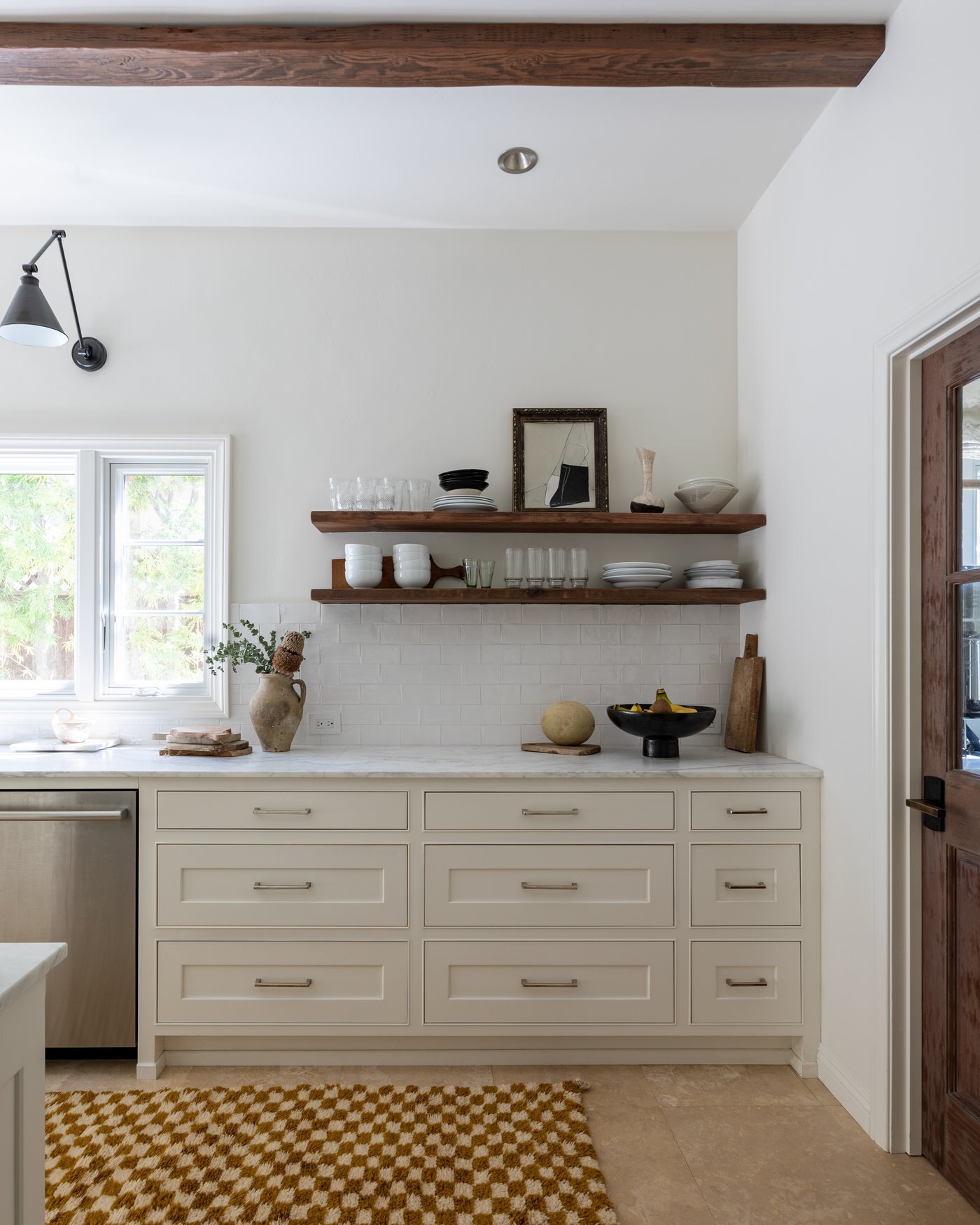
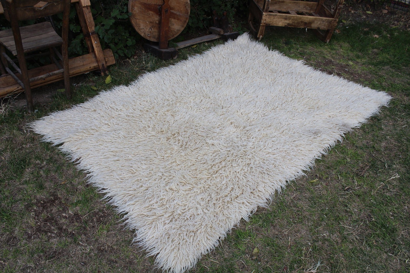
Fool’s Gold Checkmate 02 Rug shown in the stunning kitchen of Carol Estes.
Photography: Laurel Wood Creative
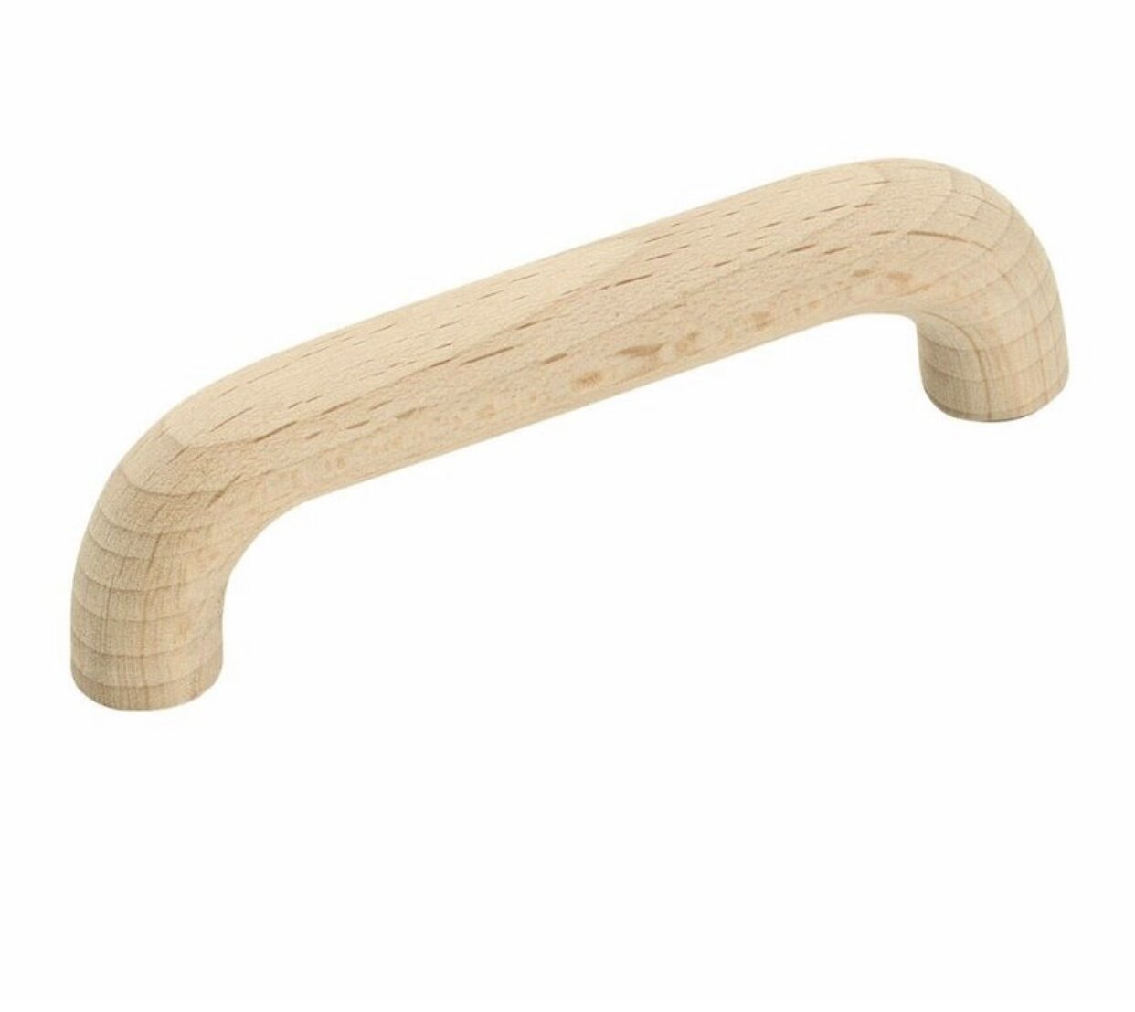
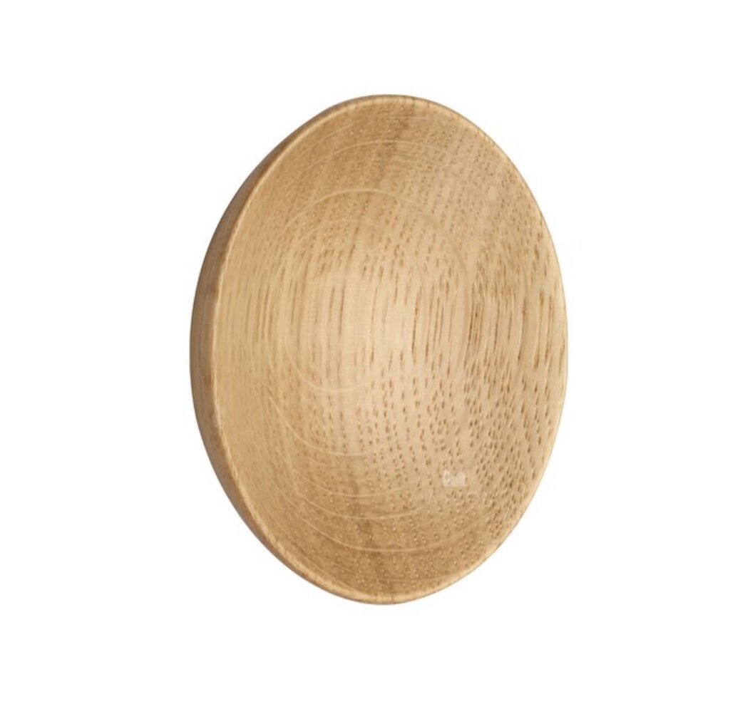
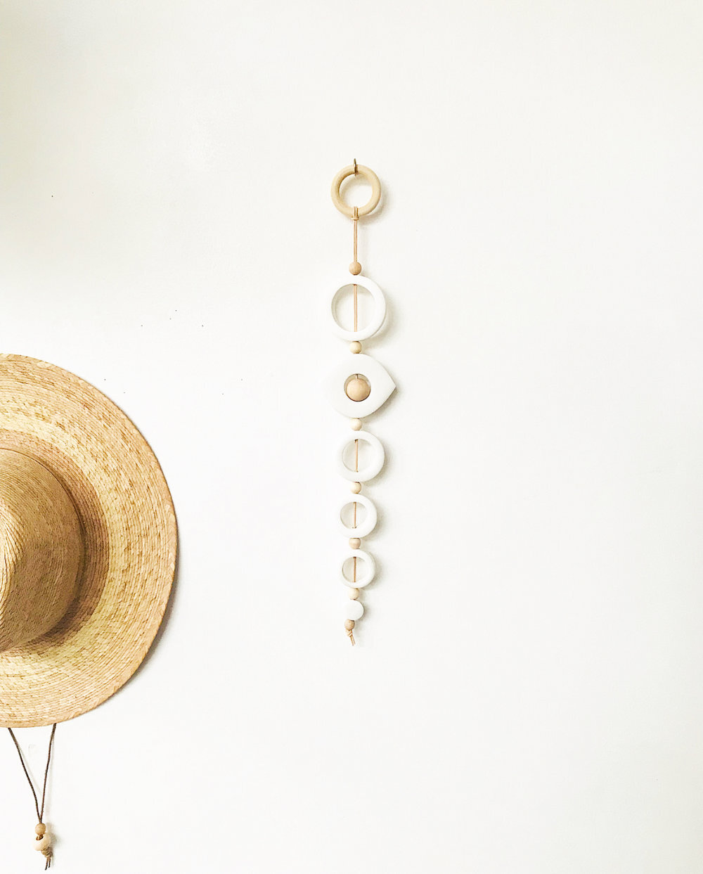
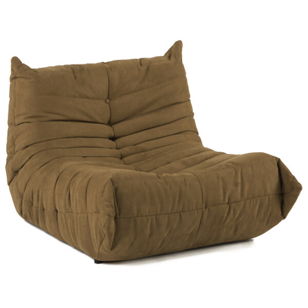
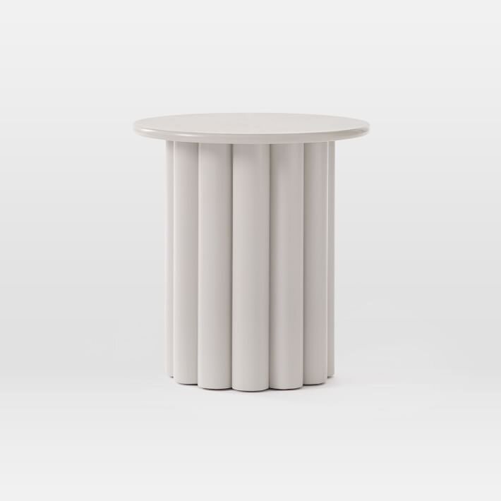
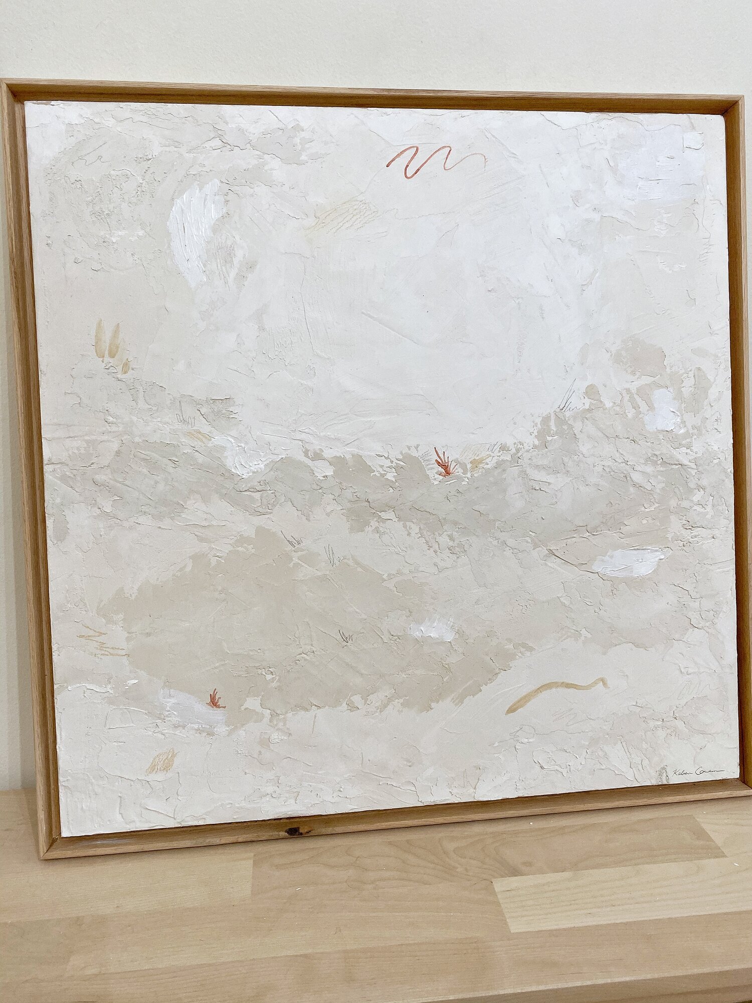
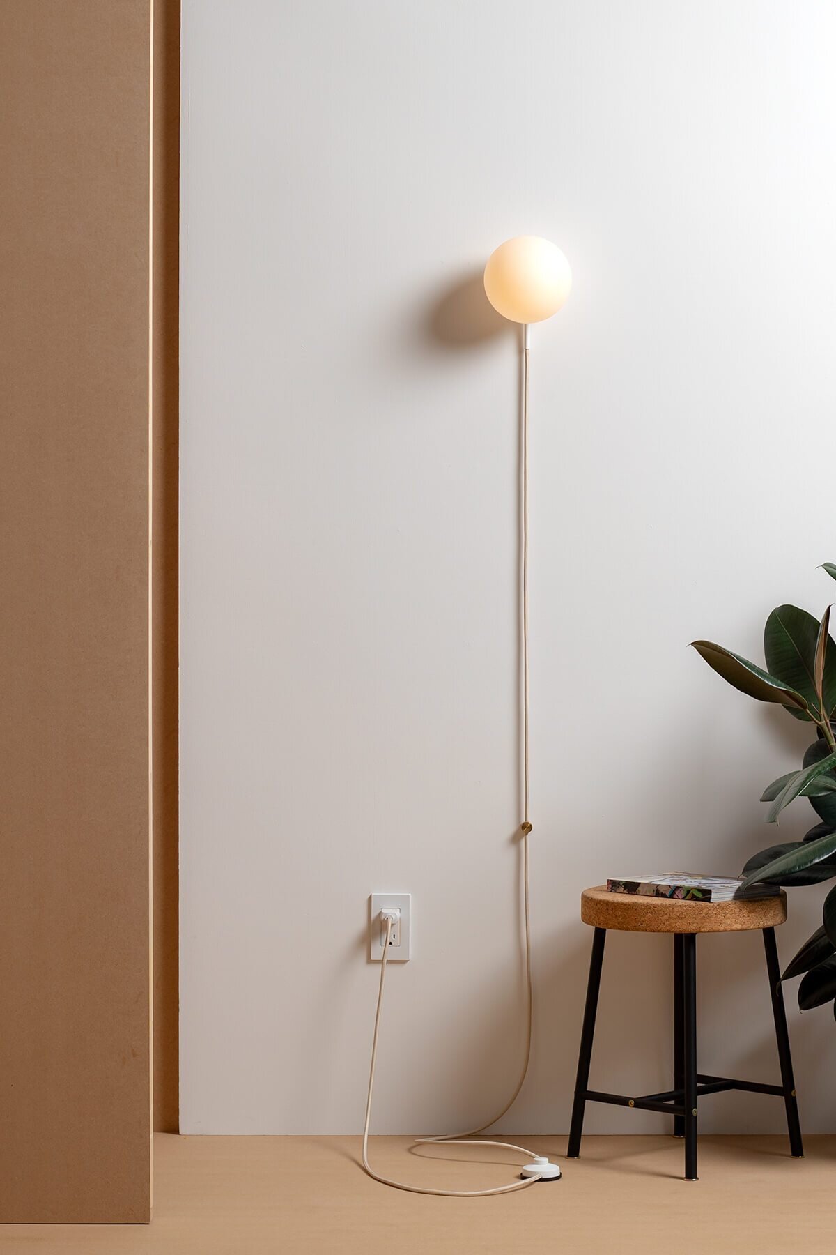
One colorway that is really calling our names from the collection is the “Fool’s Gold.” It’s the perfect mix of warm mustard, earthy ochre, and burnt-golden orange. It feels almost like a neutral in our eyes and can work year-round. "Fool’s Gold" pairs well with other warm earth tones, soft neutrals, and even a bold contrast color, like black. You can see it here styled flawlessly in Carol Estes Design’s home as the ultimate grounding and textural base. So on that note, we thought it would be fun to give you all a couple of styling ideas and décor pairings so you can nail a foolproof “Fool’s Gold” look in your own home. Happy shopping, friends!


